Overview

Sarda Farms is a Dairy that delivers fresh milk & milk products. The app is used to select & purchase products as well as create delivery patterns for recurring deliveries.

The app faced major usability challenges. A cluttered home screen, inconsistent workflows, and scattered navigation made even basic tasks unnecessarily complex. User interviews revealed the biggest frustration was managing delivery patterns, which involved cumbersome, multi-step processes.

To address these pain points, I introduced a dashboard-style home screen with clear visual hierarchy, consistent design across workflows, and a bottom navigation bar for seamless access to key features. The redesign transformed the app into a clean, intuitive, and user-friendly experience.

The Current App & Its Problems

The current app has various problems just at first glance:

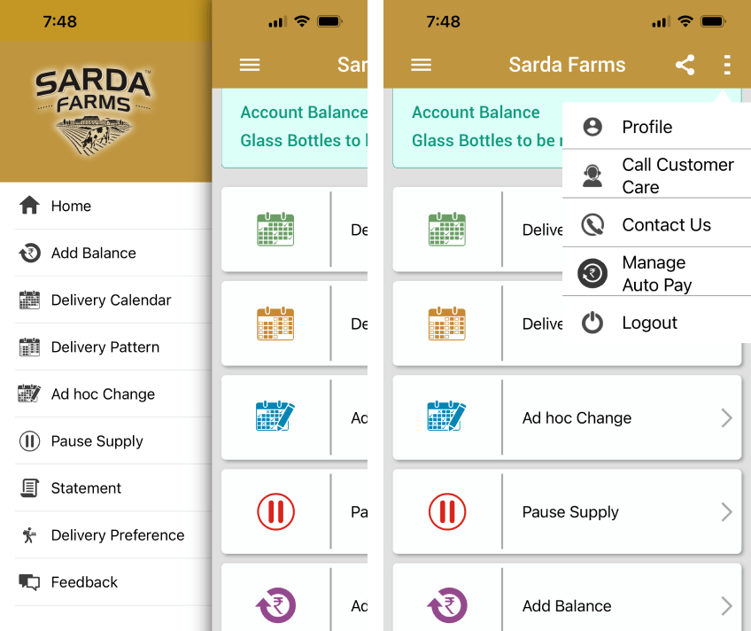
  1. Navigation - The most glaring issue is definitely that there is no back button on any of the screens making it incredibly difficult to exit a flow or go back to the home screen. Navigation items are scattered between a hamburger menu and three dots menu.
Home screen of the current Sarda app
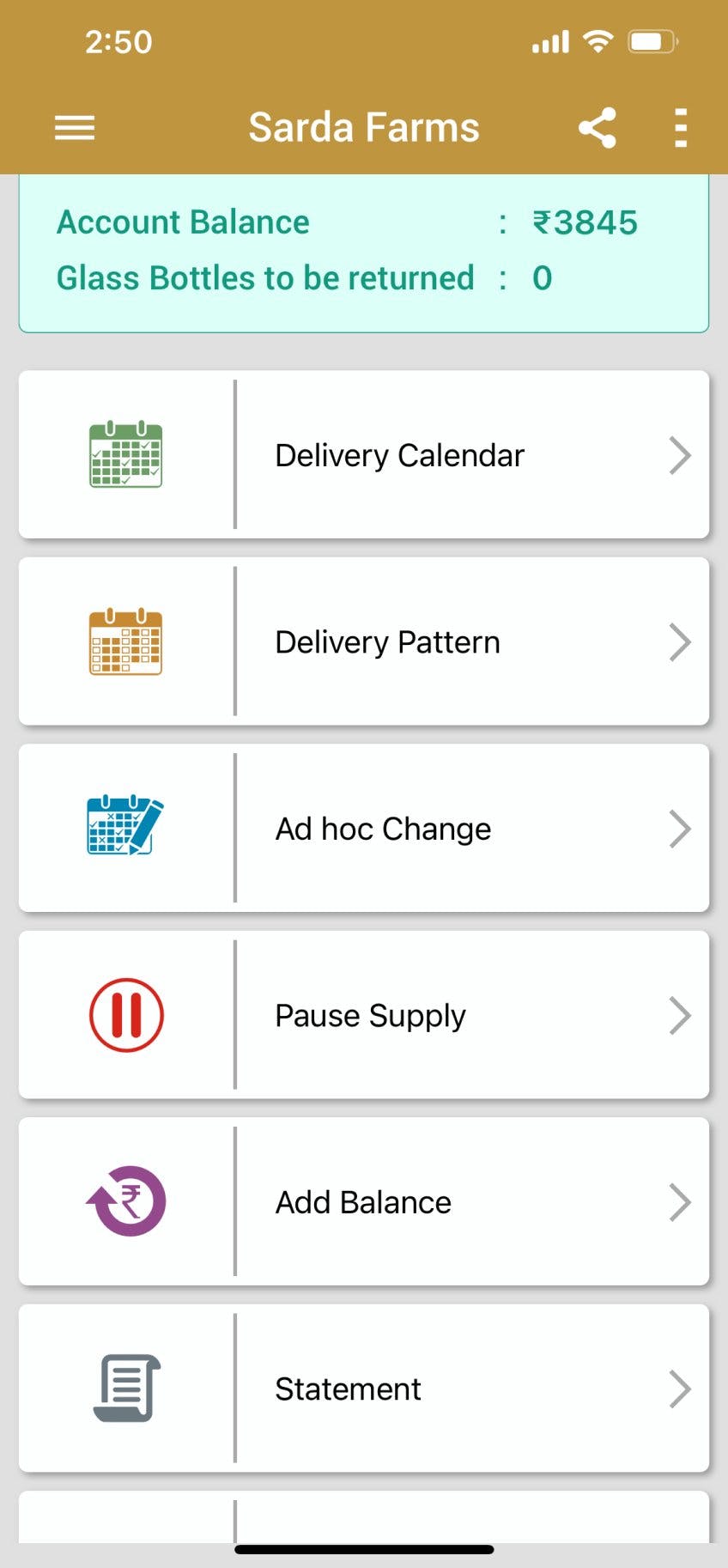
  1. Home Screen - The Home screen presents almost all flows of the app on one page with no visual heirarchy. There is also a poor choice in colors, namely too many seemingly disjointed colors.
Home screen of the current Sarda app
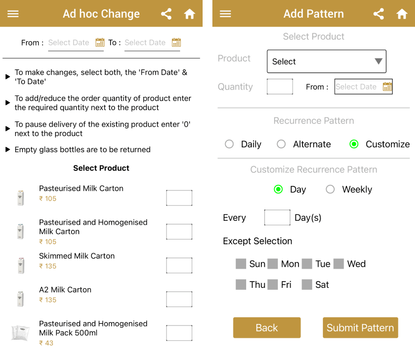
  1. Product Selection Inconsistency - The Product Selection appears on the Ad Hoc Change screen as well as the Add Pattern screen but they are completely different. In the Ad ho change, all products are listed out with number inputs while the Add Pattern page uses a dropdown.
Examples of the inconsistent Product Selection inputs

User Interview

I interviewed a user to find out the main pain point of using the current app. They said that the most frustrating part of using the app is to edit existing patterns & create ad hoc changes. Creating an ad hoc change does not override the current delivery pattern. So if an existing pattern has 2L of milk to be delivered. Creating an ad hoc change only allows you to add 1L above the existing 2L rather than reducing from 2 to 1. To achieve this, one must pause a pattern, create an ad hoc change and remember to resume the delivery once the ad hoc change is done.
The Solutions

  1. The Home screen was redesigned in a Dashboard style that follows the principle of Visual Hierarchy so that important information like the account balance and the upcoming deliveries are visible at first glance. It is also easy to add balance & edit upcoming orders right from the home screen.
  2. A Bottom bar of navigation was added to allow navigating to the most important screens. Less important functionality was clubbed under these sections, namely Home, Deliveries, Billing & Support. Profile settings are accessible from your avatar at the top left and app settings are available from the icon on the top right
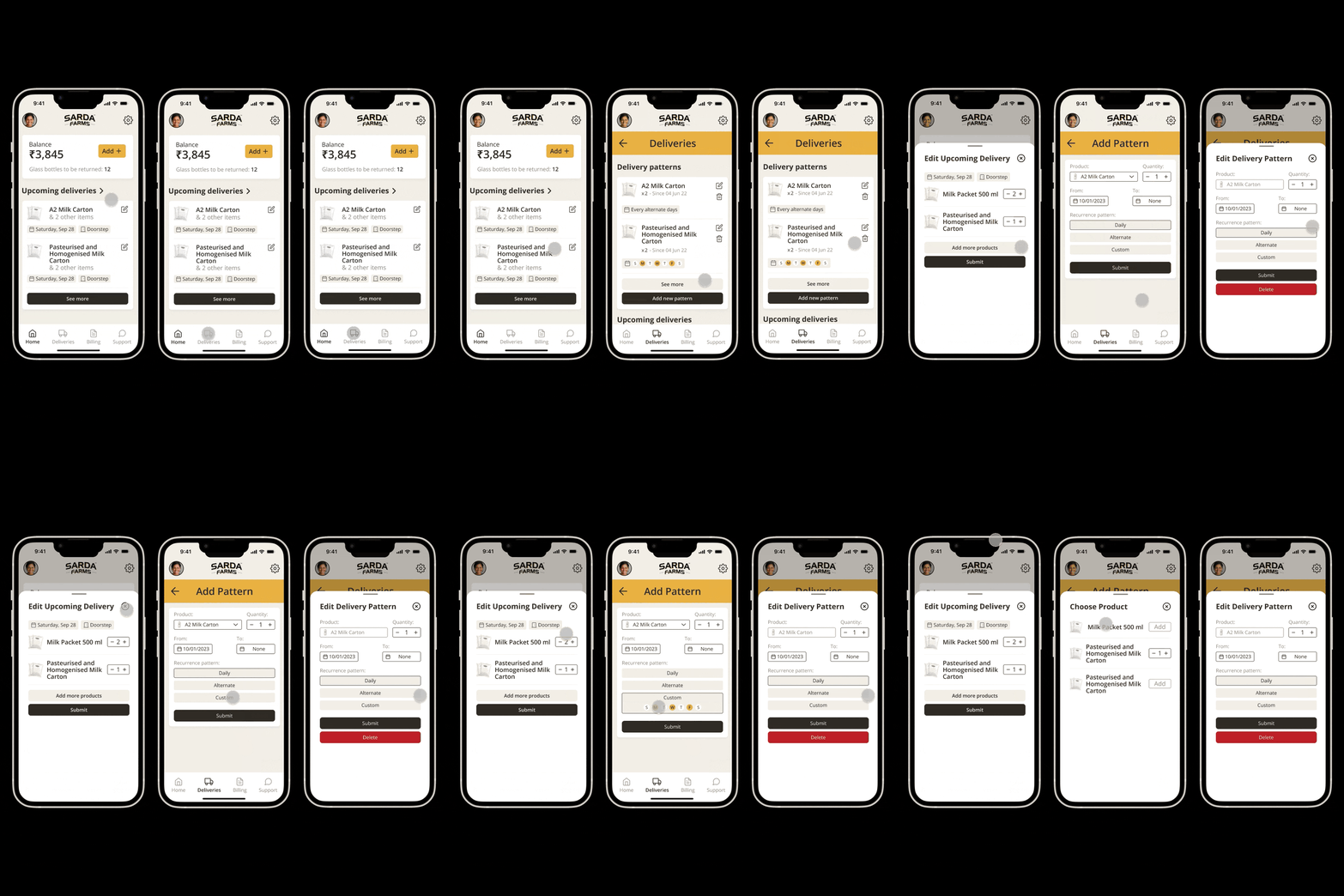
  3. The flows for Adding a Pattern, Editting a Patter & Editting a Delivery was designed to look consistent with eachother - specially the Choose Products popup.
Examples of the new UI & flows for adding & editting deliveries

Conclusion & Final Product

The final outcome results in the app looking modern, consistent and clean. Although it is a major overhaul compared to the current app, the flows are now more intuitive and the dashboard layout of the home screen allows for important information to be visible at a quick glance. Other screens are now categorised intuitively into Deliveries, Billing & Support sections rather than being plainly listed on the home page.
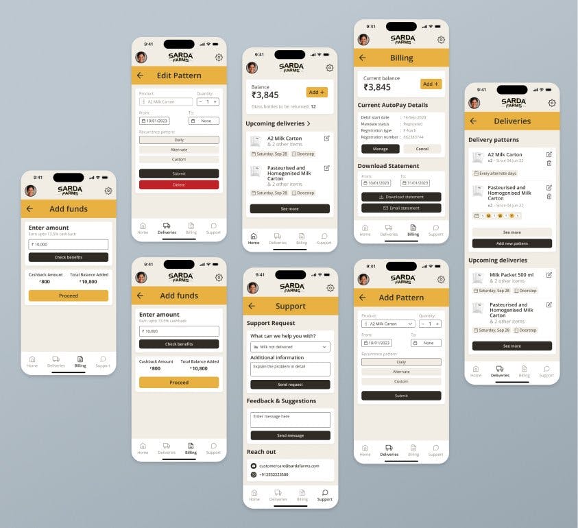
All the new UI screens & flows for adding & editing deliveries